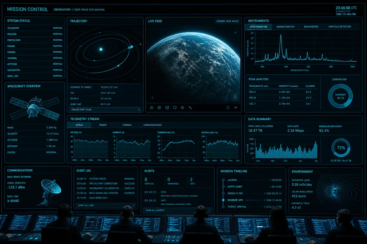
A research organization collecting high-frequency environmental sensor data needed a way for scientists to explore and visualize that data interactively, without waiting on a data engineering team to build a new chart every time a research question changed. Here's how we built a dashboard flexible enough to keep up with actual research workflows.
The Core Requirement: Exploration, Not Fixed Reports
Most dashboard projects default to a fixed set of predefined charts. That works for operational monitoring, but it fails for scientific exploration, where researchers need to slice data by arbitrary combinations of variables, time ranges, and sensor locations that weren't anticipated when the dashboard was built. We designed around flexible, parameterized visualization rather than a fixed report set.
Architecture
Time-Series Data Storage
High-frequency sensor data (readings every few seconds across hundreds of sensor locations) doesn't perform well in a general-purpose relational database at query time for exploratory analysis. We used a time-series-optimized storage layer (TimescaleDB, built on PostgreSQL) that handles high-frequency time-series data efficiently while still supporting the relational joins needed to bring in sensor metadata.
-- Continuous aggregate for fast dashboard queries at various time granularities
CREATE MATERIALIZED VIEW sensor_hourly_avg
WITH (timescaledb.continuous) AS
SELECT
    time_bucket('1 hour', reading_time) AS bucket,
    sensor_id,
    avg(value) AS avg_value,
    max(value) AS max_value,
    min(value) AS min_value
FROM sensor_readings
GROUP BY bucket, sensor_id;
Continuous aggregates pre-compute common time-bucketed rollups, so dashboard queries over long time ranges stay fast without scanning raw high-frequency data every time.
Interactive Query Layer
The frontend lets researchers build queries visually — selecting sensor groups, date ranges, and aggregation levels — which translate into parameterized backend queries rather than a fixed set of API endpoints per chart type. This let the dashboard adapt to research questions the original design didn't anticipate.
Visualization Rendering
We used a combination of D3.js for custom scientific visualizations (contour maps, multi-axis time series with anomaly highlighting) and a standard charting library for more conventional views, letting researchers switch between visualization types for the same underlying data without re-querying.
Export for Further Analysis
Dashboards are useful for exploration, but researchers ultimately needed to run their own statistical analysis in R or Python. Every view includes a "download underlying data" option that exports exactly the filtered, aggregated dataset behind the current visualization — not the full raw dataset, which would be unwieldy for most analysis needs.
Handling Data Quality Issues Visibly
Sensor data has gaps, calibration drift, and occasional bad readings. Rather than silently interpolating over these issues (which can mislead researchers about data reliability), we built explicit visual indicators for data quality flags — gap regions are shown distinctly from continuous data, and readings flagged by calibration checks are visually marked rather than blended in with clean data.
Performance at Scale
With hundreds of sensors reporting every few seconds, naive dashboard queries over multi-month time ranges would be far too slow for interactive use. Combining TimescaleDB continuous aggregates with appropriate query-level caching kept typical dashboard interactions responsive even across the full multi-year dataset.
Results
Researchers who previously had to submit chart requests to a data engineering team and wait days for a new visualization can now explore the full sensor dataset interactively, dramatically shortening the iteration loop between having a research question and getting a visual answer to it.
Have scientific or operational data that needs a real exploration tool, not just fixed reports? Discuss your project — 907-841-8407 or contact@rutagon.com.
Frequently Asked Questions
Why not use a general-purpose BI tool for scientific data visualization?
General-purpose BI tools work well for standard business metrics but often can't handle the custom visualization types (contour maps, specialized time-series overlays) or the query flexibility researchers need for genuinely exploratory analysis of high-frequency scientific data.
What is TimescaleDB and why use it for sensor data?
TimescaleDB is a time-series-optimized extension built on PostgreSQL, designed to efficiently store and query high-frequency time-series data while still supporting standard relational joins for metadata — useful when sensor readings need to be combined with location or equipment data.
How do you handle bad or missing sensor readings in a dashboard?
We recommend surfacing data quality issues visibly rather than silently interpolating over them — showing gap regions distinctly and marking flagged readings — so researchers understand the reliability of what they're looking at rather than being misled by smoothed-over data.
Can dashboard data be exported for further statistical analysis?
Yes, well-designed scientific dashboards should support exporting the specific filtered and aggregated dataset behind the current view, letting researchers continue analysis in tools like R or Python without needing the full raw dataset.
How do continuous aggregates improve dashboard performance?
They pre-compute common time-bucketed rollups (hourly, daily averages) so queries over long time ranges don't need to scan raw high-frequency data every time, keeping interactive exploration responsive even over large historical datasets.