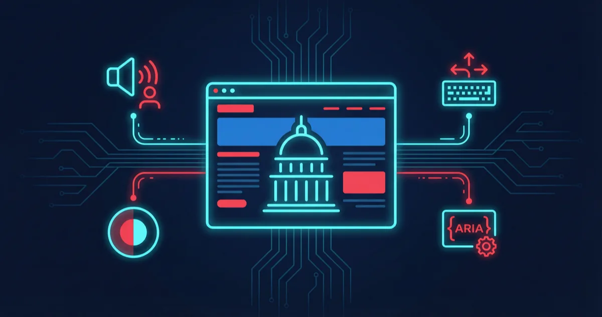
Section 508 compliance is not a checkbox exercise. Every federal website and every website built for a federal agency must be accessible to users with disabilities — and "accessible" means conforming to WCAG 2.1 AA standards across every page, every interaction, and every content update. Rutagon builds 508-compliant government websites by embedding accessibility into the development process from the first component, not bolting it on before launch.
When we built our content platform — 30+ pages delivering sub-second load times through CloudFront and Terraform-managed infrastructure — accessibility was a first-class requirement from sprint one. The patterns we developed there now form the foundation of every web project we deliver, commercial or government.
Why 508 Compliance Requires Engineering, Not Just Auditing
Most accessibility failures are engineering failures. A missing alt attribute is not a content oversight — it is a component that was built without accessibility as a requirement. A modal that traps keyboard focus is not a minor bug — it makes the entire workflow inaccessible to users who cannot use a mouse.
Rutagon treats accessibility violations the same way we treat security vulnerabilities: they block deployment. Our CI/CD pipelines run automated accessibility checks on every pull request, and components that fail do not ship.
Semantic HTML as the Foundation
The single most impactful accessibility decision is also the simplest: use semantic HTML elements for their intended purpose.
<!-- Accessible page structure -->
<header role="banner">
<nav aria-label="Primary navigation">
<ul>
<li><a href="/services">Services</a></li>
<li><a href="/about" aria-current="page">About</a></li>
<li><a href="/contact">Contact</a></li>
</ul>
</nav>
</header>
<main id="main-content">
<article>
<h1>Our Government IT Services</h1>
<section aria-labelledby="cloud-heading">
<h2 id="cloud-heading">Cloud Infrastructure</h2>
<p>Rutagon delivers AWS infrastructure for government agencies...</p>
</section>
</article>
</main>
<footer role="contentinfo">
<p>© 2026 Rutagon. All rights reserved.</p>
</footer>
This is not complicated markup. But it communicates page structure to screen readers in a way that <div class="header"> never will. The <nav> element with aria-label tells assistive technology exactly what kind of navigation it is. The aria-current="page" attribute tells a user which page they are on without relying on visual styling. The heading hierarchy (h1 → h2) creates a navigable document outline.
On our content platform, every page follows this structure. No heading levels are skipped. No navigation relies on visual cues alone. Every landmark region is labeled.
ARIA Patterns for Interactive Components
ARIA (Accessible Rich Internet Applications) attributes bridge the gap between custom interactive components and what assistive technologies can interpret. The rule is straightforward: use native HTML elements when they exist. Reach for ARIA only when building custom interactions that HTML does not provide natively.
function Accordion({ items }: AccordionProps) {
  const [openIndex, setOpenIndex] = useState<number | null>(null);

  return (
    <div>
      {items.map((item, index) => {
        const isOpen = openIndex === index;
        const headingId = `accordion-heading-${index}`;
        const panelId = `accordion-panel-${index}`;

        return (
          <div key={index}>
            <h3>
              <button
                id={headingId}
                aria-expanded={isOpen}
                aria-controls={panelId}
                onClick={() => setOpenIndex(isOpen ? null : index)}
              >
                {item.title}
                <span aria-hidden="true">{isOpen ? '−' : '+'}</span>
              </button>
            </h3>
            <div
              id={panelId}
              role="region"
              aria-labelledby={headingId}
              hidden={!isOpen}
            >
              {item.content}
            </div>
          </div>
        );
      })}
    </div>
  );
}
The aria-expanded attribute communicates state. The aria-controls attribute connects the button to the panel it controls. The hidden attribute removes the panel from both visual display and the accessibility tree. The decorative plus/minus icon uses aria-hidden="true" so screen readers do not announce it.
These are not optional enhancements. They are required for WCAG 2.1 AA conformance on any page that uses accordion patterns.
Keyboard Navigation and Focus Management
Every interactive element must be operable with a keyboard alone. This means logical tab order, visible focus indicators, and proper focus management when content changes dynamically.
/* Visible focus indicators — never remove outline without replacing it */
:focus-visible {
  outline: 3px solid #06b6d4;
  outline-offset: 2px;
  border-radius: 2px;
}

/* Skip-to-content link — visible on focus */
.skip-link {
  position: absolute;
  left: -9999px;
  top: 0;
  z-index: 100;
  padding: 0.75rem 1.5rem;
  background: #0f172a;
  color: #ffffff;
  font-weight: 600;
}

.skip-link:focus {
  left: 0;
}
The skip-to-content link is one of the most commonly missed 508 requirements. Without it, keyboard users must tab through the entire navigation on every page load before reaching the main content. On our content platform, the skip link is the first focusable element on every page.
Focus management becomes critical with modals, dialogs, and dynamic content. When a modal opens, focus must move into it. When it closes, focus must return to the element that triggered it. Focus must be trapped within the modal while it is open.
function useModalFocus(isOpen: boolean, modalRef: RefObject<HTMLDivElement>) {
  const triggerRef = useRef<HTMLElement | null>(null);

  useEffect(() => {
    if (isOpen) {
      triggerRef.current = document.activeElement as HTMLElement;
      const firstFocusable = modalRef.current?.querySelector<HTMLElement>(
        'button, [href], input, select, textarea, [tabindex]:not([tabindex="-1"])'
      );
      firstFocusable?.focus();
    } else if (triggerRef.current) {
      triggerRef.current.focus();
    }
  }, [isOpen, modalRef]);
}
Color Contrast and Visual Design
WCAG 2.1 AA requires a minimum contrast ratio of 4.5:1 for normal text and 3:1 for large text (18px+ or 14px+ bold). This is not a suggestion — it is a measurable, testable requirement.
Rutagon's brand colors are designed with these ratios in mind:
| Combination | Ratio | Passes AA |
|---|---|---|
| White (#FFFFFF) on Deep Space (#0f172a) | 17.4:1 | Yes |
| Cyan (#06b6d4) on Deep Space (#0f172a) | 7.8:1 | Yes |
| Red (#D70000) on White (#FFFFFF) | 5.1:1 | Yes |
| Deep Space (#0f172a) on White (#FFFFFF) | 17.4:1 | Yes |
We never use color as the sole indicator of meaning. Error states include both a red color and an icon with descriptive text. Required form fields are labeled with text ("Required"), not just an asterisk that might not be perceivable.
Automated Accessibility Testing in CI/CD
Manual accessibility testing catches nuanced issues that tools miss, but automated testing catches the regressions that humans overlook between sprints. We run both.
Our CI/CD pipeline includes three layers of automated accessibility checks:
Build-time static analysis with eslint-plugin-jsx-a11y catches missing alt text, invalid ARIA attributes, and non-interactive elements with click handlers during development.
Integration testing with axe-core runs against rendered components in our test suite:
import { axe, toHaveNoViolations } from 'jest-axe';
import { render } from '@testing-library/react';

expect.extend(toHaveNoViolations);

describe('ServiceCard accessibility', () => {
  it('has no accessibility violations', async () => {
    const { container } = render(
      <ServiceCard
        title="Cloud Infrastructure"
        description="AWS architecture for government agencies"
        href="/services/cloud"
      />
    );
    const results = await axe(container);
    expect(results).toHaveNoViolations();
  });
});
End-to-end audits with Lighthouse CI run against deployed preview environments. Any page scoring below 95 on accessibility blocks the merge.
This three-layer approach means accessibility regressions are caught before they reach production. On our content platform, every page maintains a Lighthouse accessibility score of 100.
Content Accessibility Beyond Code
508 compliance extends beyond markup. Content must be accessible too:
- Images require meaningful alt text that conveys purpose, not just description. A chart needs alt text that summarizes the data, not "a bar chart."
- PDFs must be tagged and structured. Scanned documents without OCR and proper tagging are inaccessible.
- Videos require captions and transcripts.
- Link text must be descriptive. "Click here" tells a screen reader user nothing about the destination. "View our cloud infrastructure services" tells them everything.
- Reading level should target plain language wherever possible. Government content especially benefits from clear, direct writing.
Testing with Real Assistive Technologies
Automated tools catch roughly 30-40% of accessibility issues. The rest require manual testing with actual assistive technologies.
Rutagon tests with:
- VoiceOver (macOS/iOS) for screen reader navigation
- Keyboard-only navigation through every interactive flow
- Browser zoom at 200% and 400% to verify content reflow
- High contrast mode in Windows to verify that content remains perceivable
- Reduced motion media query to verify animations respect prefers-reduced-motion
This is not a pre-launch checklist. It is part of our definition of done for every feature.
For details on how we build high-availability government web systems, see our article on high-availability aviation and aerospace systems on AWS. For migration strategies that maintain accessibility standards, see GCP to AWS migration for government.
Frequently Asked Questions
What is the difference between Section 508 and WCAG 2.1?
Section 508 is the federal law requiring accessible information technology. In 2017, the Section 508 Refresh aligned the technical standards with WCAG 2.0 AA. Rutagon targets WCAG 2.1 AA — which includes additional criteria around mobile accessibility and cognitive considerations — because it exceeds the minimum 508 requirement and provides a better experience for all users.
How do you handle third-party components and accessibility?
Every third-party component is evaluated for accessibility before adoption. If a library does not meet WCAG 2.1 AA, we either contribute fixes upstream, wrap the component with accessible markup, or choose an alternative. We never ship a third-party component that introduces accessibility violations.
Can accessibility be added to an existing website retroactively?
It can, but it is significantly more expensive than building it in from the start. Retrofit projects often uncover structural issues — improper heading hierarchies, inaccessible navigation patterns, color contrast failures across the design system — that require rethinking components from the ground up. Rutagon recommends building accessibility into the component library from day one.
Does accessibility affect website performance?
Semantic HTML is actually lighter than div-heavy markup. Properly structured pages tend to have cleaner DOM trees, which improves rendering performance. On our content platform, accessibility-first development contributed to the sub-second load times — clean markup, minimal DOM depth, and efficient component trees benefit both assistive technologies and browsers.
How often should accessibility audits be performed?
Automated checks should run on every pull request. Manual audits with assistive technologies should happen at minimum before every major release and quarterly for ongoing projects. Content audits — checking new images, PDFs, and copy for accessibility — should be continuous.
Discuss your project with Rutagon
Contact Us →